NASA Eclipse Soundscape Re-Design
Academic Project
Making NASA’s Eclipse Soundscapes page clear, accessible, and WCAG-compliant

Role
UX Designer
Timeline
2 weeks
Collaborators
2 Designers
NASA CO-Project Lead
Skills
Accessibility (WCAG)
Client Relations
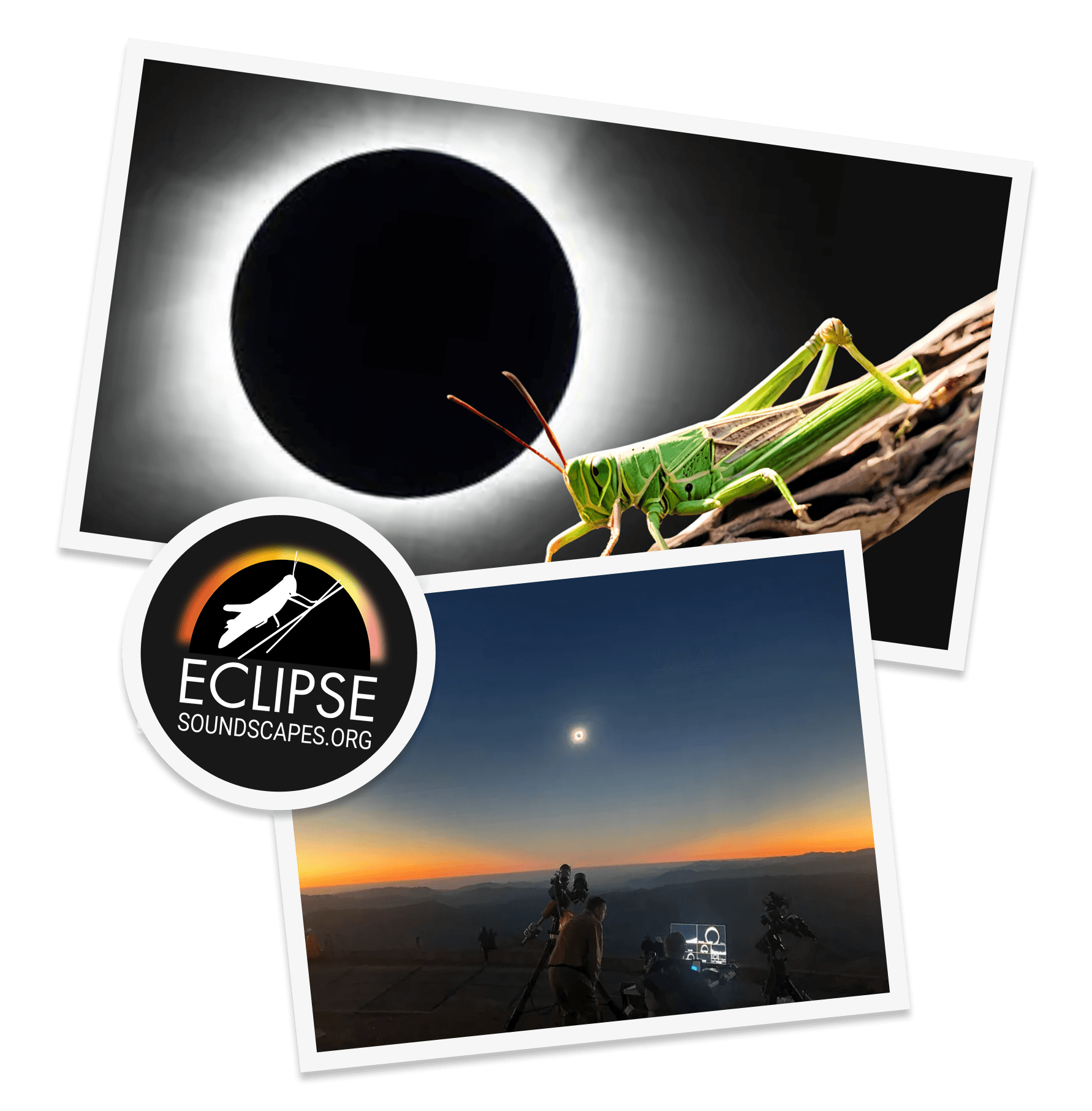
What is Eclipse Soundscape?
Eclipse Soundscape (ES) is a NASA funded citizen science project that invites people to explore how solar eclipses impact life on Earth. Their mission is to allow visually and hearing impaired individuals experience the eclipse through sound and touch.
My role
My team and I partnered with NASA Eclipse Soundscape to re-design their Data Analyst (DA) site for volunteers analyzing the acoustic data recorded during an eclipse. As a UX Designer, I helped transform the layout to make it easier for new and returning volunteers to understand their role and confidently participate.
Overview
NASA wants participation in the citizen science projects to be more accessible. With Eclipse Soundscape, NASA wishes to:


Discovery
NASA has a website for ES’ Data Analyst (DA) role. The information DAs collect helps NASA map environmental changes during eclipses.
The website gives new and returning users an overview of the responsibilities of a Data Analyst and demonstrate the skills that are needed to participate as a data analyst. Below the task flow of a ES DA

Listen to 3 different eclipse audio recordings

In each, observe what particular sounds are in the recording

Record your observations in the embedded Google Form
Audit: Landing Page
Landing Page gives visitors context on what the DA role is and what to expect from it

Audit: Audio Analysis Page 1/2
Audio Analysis provides onboarding instructions prior to the process

Audit: Audio Analysis Page 2/2
Users have multiple ways of navigating to the next audio segment
Layout does not have strict section boundaries when user is performing each step which risks users bypassing important parts of the analysis.
Core Discovery Insight
The current layout create friction in the DA onboarding and analysis process
The audit presented that the website has a lack of visual hierarchy and structural boundaires that may contribute to user confusion in navigating through the site.
How might we simplify the Data Analyst section to ensure clarity and accessibility for all users?
Identifying our users
Who are we designing for?
While NASA welcomes everyone to become a Data Analyst in Eclipse Soundscape. We're designing with young adults in mind, particularly those new to citizen science projects.
User Research
To understand user pain points, we conducted interviews to gauge areas of struggle.
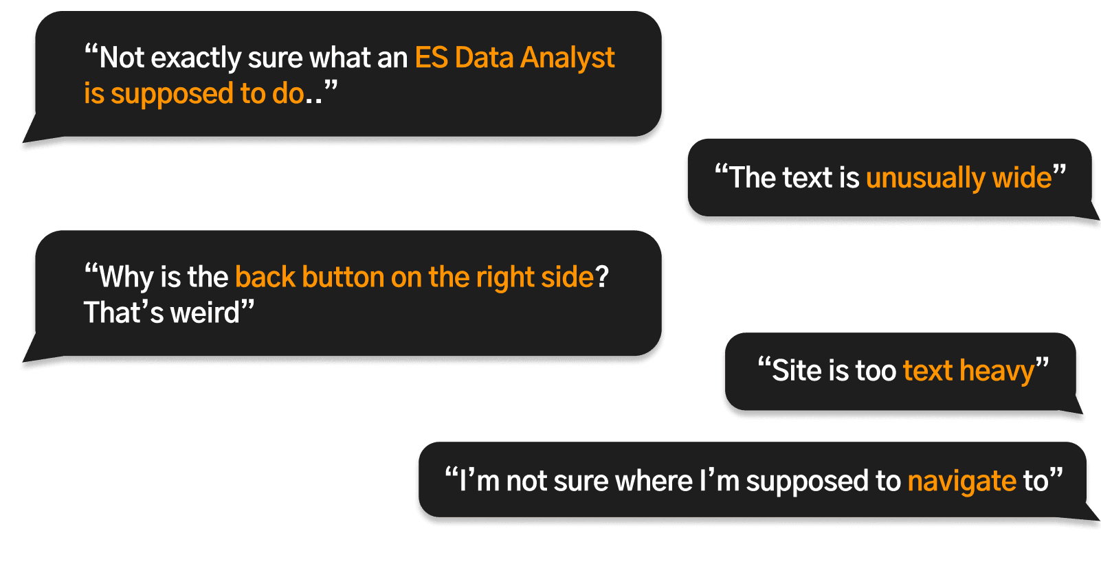
We had 6 users, who are young adults that have no experience with citizen science projects navigate through the website. Some comments included...
Insights from User Research
We synthesized key points based on user interviews
Overall, NASA’s information-heavy layout overwhelmed users encountering the site for the first time. As a result, many missed important information and had issues navigating to different parts of the site.


Design Decisions
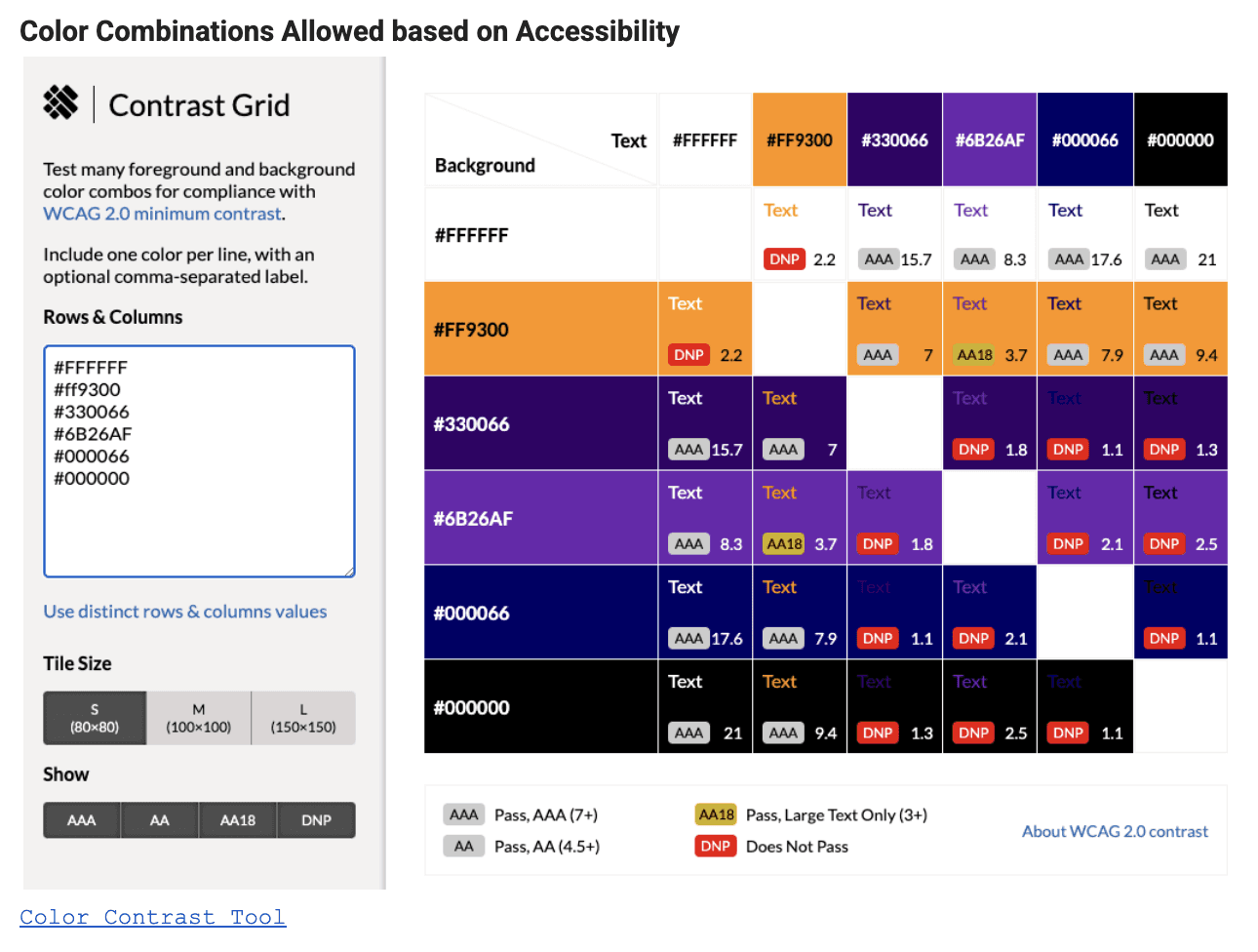
All of the layout reflected the branding colors and accessibility guidelines for NASA ES
Design Decisions
Layout based off of user feedback
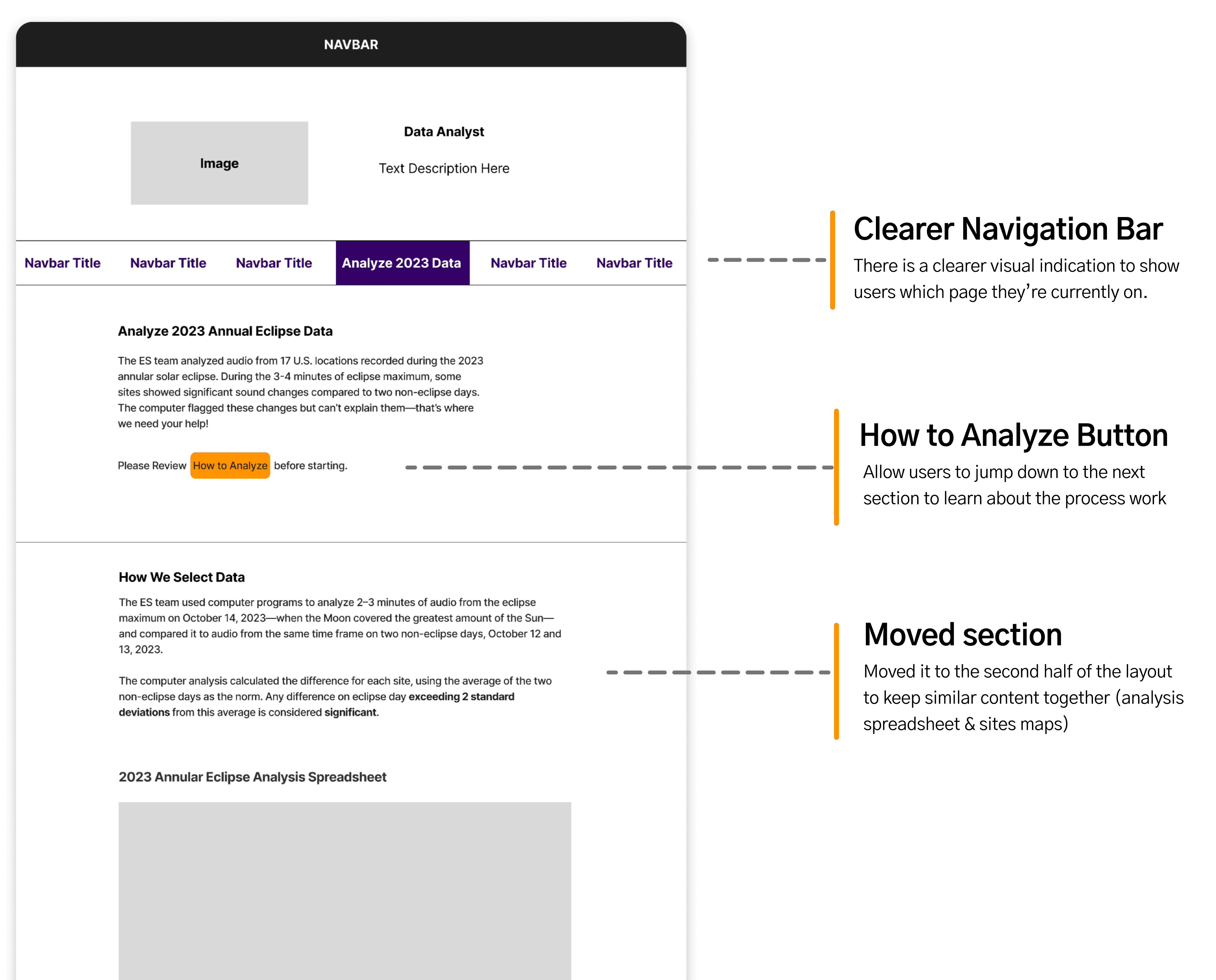
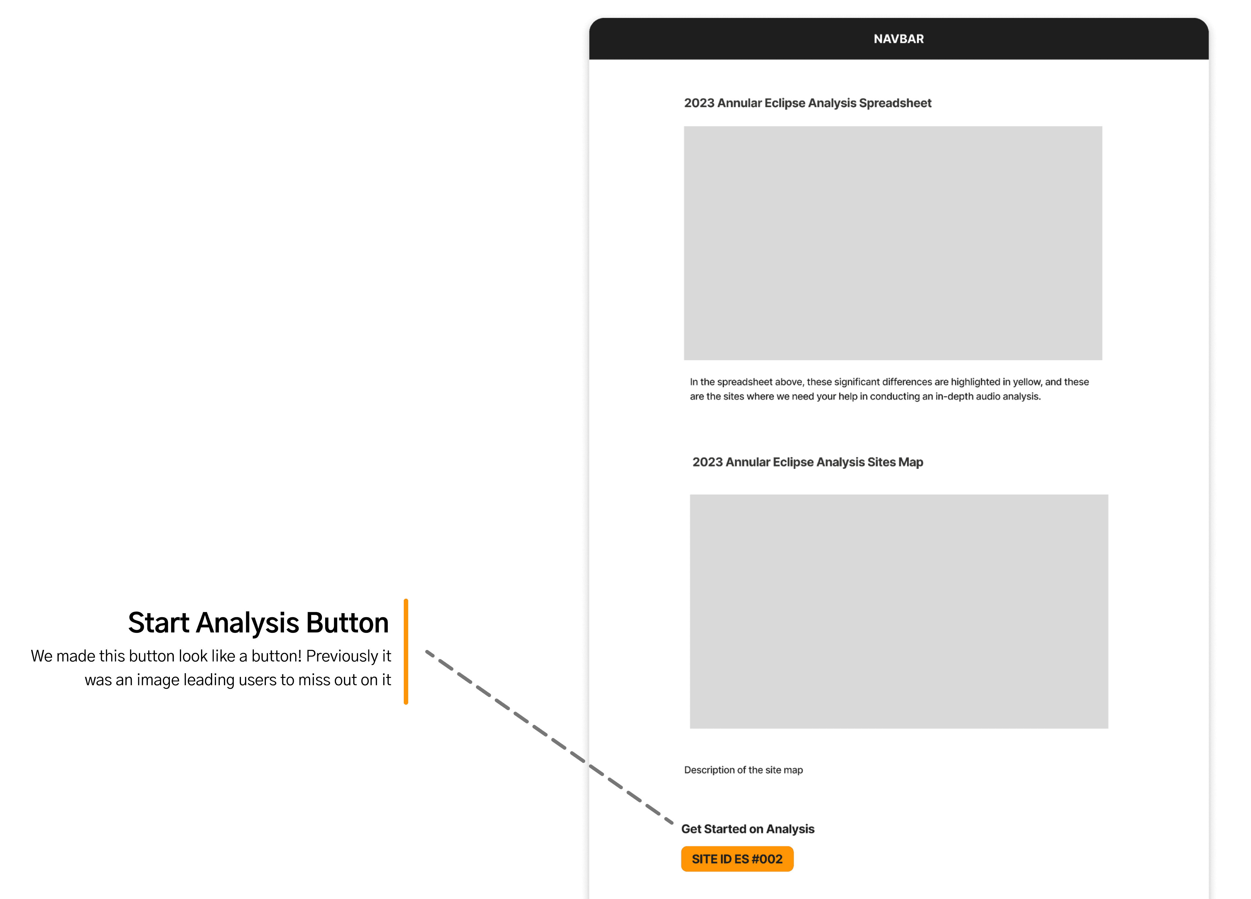
We created a cleaner layout so that users are able to navigate the site easier, have a clear context of what the ES mission and role is about.
Design Decision
We tested our iteration to the same group of users.
We performed 2 types of user tests with our users: usability testing and A/B testing. These tests were crucial in helping us refine our prototype.
Usability Tests
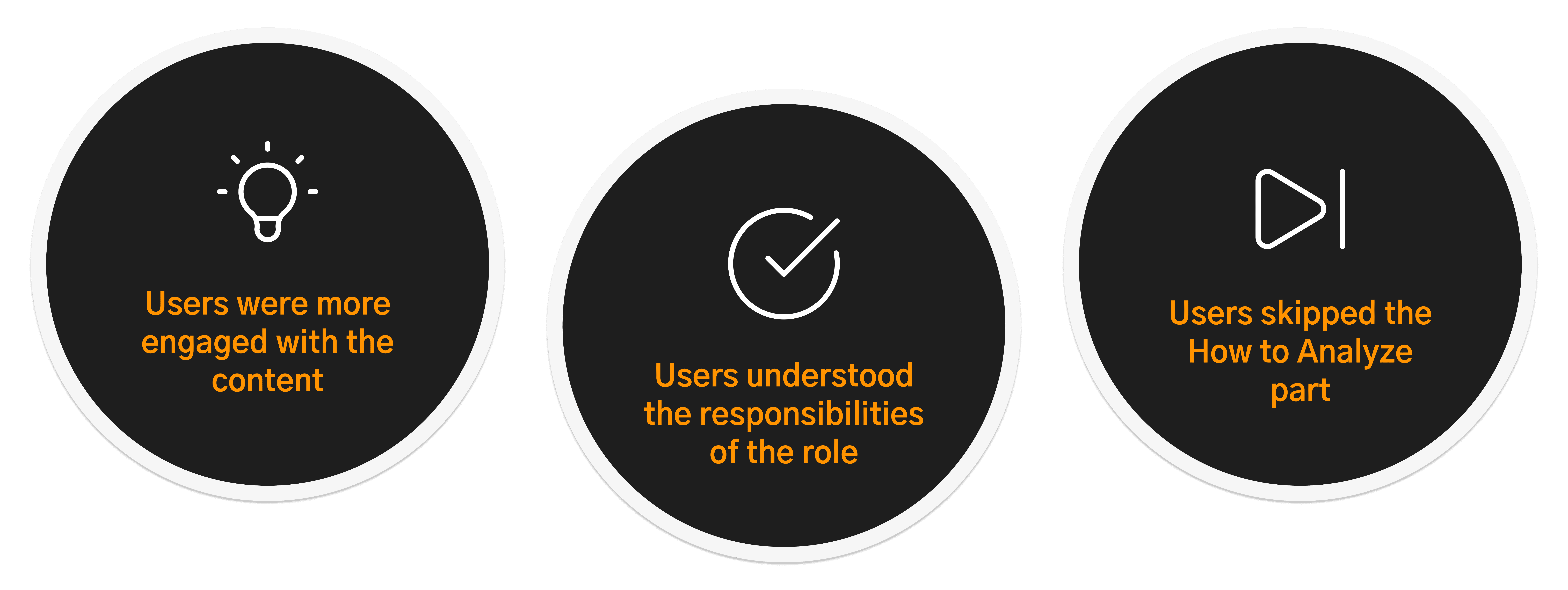
Our goal was to make our layout can help users understand ES and what the responsibilities of a Data Analyst. In this test, we had users navigate the site as they normally would and as a result we found that:
A/B Testing
We aimed to compare user preferences for the audio analysis layout.


Solution
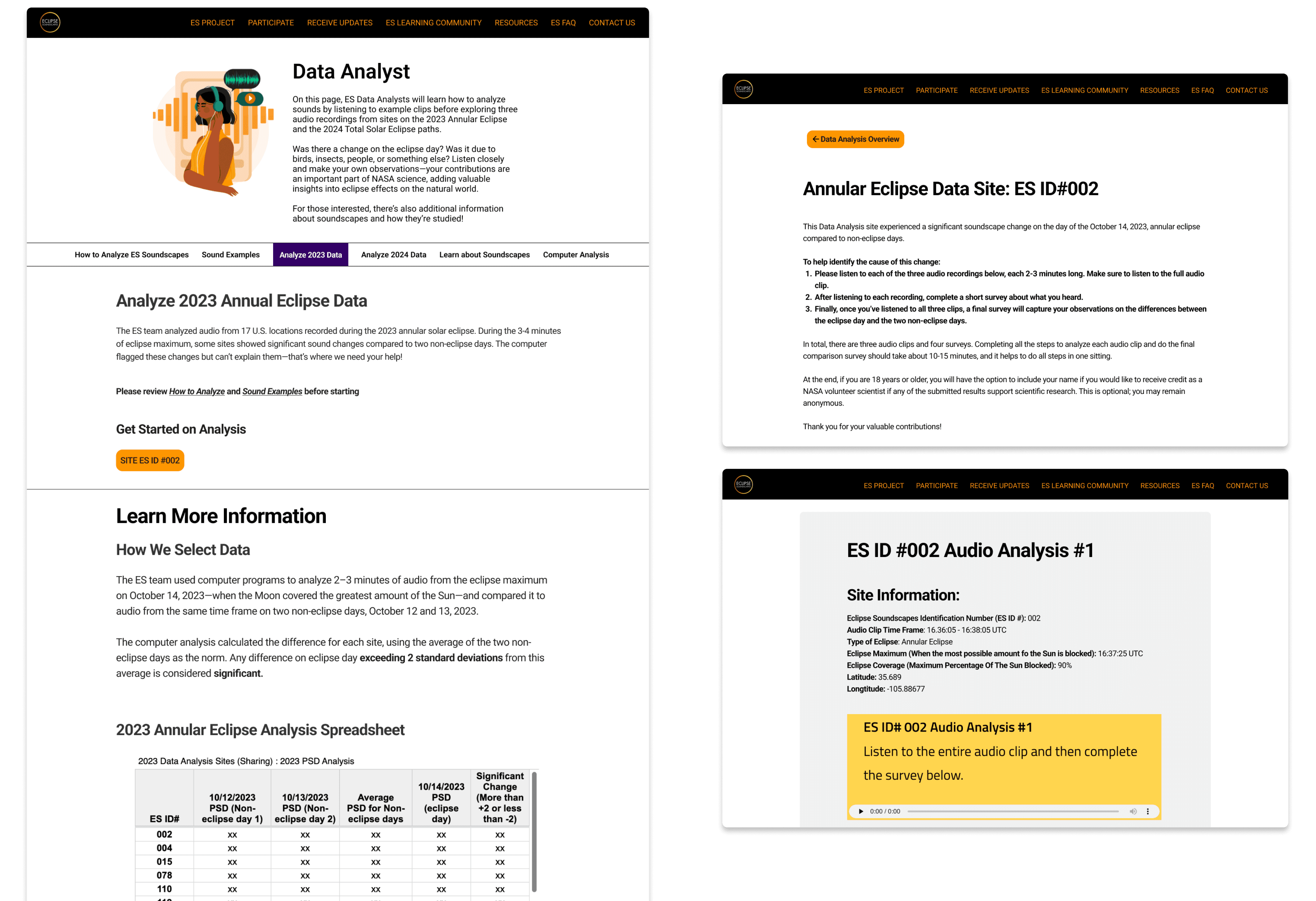
Final Deliverables at a Glance
Our final deliverable ensures that new and returning participants understand the Eclipse Soundscape project and can confidently contribute as a Data Analyst
Key Changes #1
One thing at a time.
Users can focus on the current analysis they’re doing and mitigate the risk of skipping crucial steps of the analysis.

Key Changes #2
Utilizing intuitive navigation features
Going back to landing page


Going to previous audio clip
Going to next audio clip

Impact
Simplified analysis workflow by 30%
Without compromising on information, I re-designed the workflow into a focused, single-step interface allowing users to process one piece of data at a time without feeling overwhelmed,
Ensured WCAG compliance across the layout
I established clear heading hierarchies and strong visual contrast to guarantee the site is easily scannable.
What I Learned
Learning to compromise due to limitations with client
My team and I had to reconsider some ambitious ideas because our client’s site was built on WordPress. It was important that our ideas were feasible in WordPress and didn’t go past the budget.
Navigating with limited client availability
The client had a busy schedule so it was really hard to get a hold of them and have them review our work. They weren’t available for the final deliverable but we were able to use our results from user testing to validate our re-design.
Adding more features for screen readers
Initially, we wanted to focus primarily on making an interface screen reader friendly. However, we realized it was hard to find a group of individuals who used screen readers like VoiceOver in their daily life. But it would’ve been great to have insight about what they prioritize in interface for a seamless user experience.